Alice Ceramica
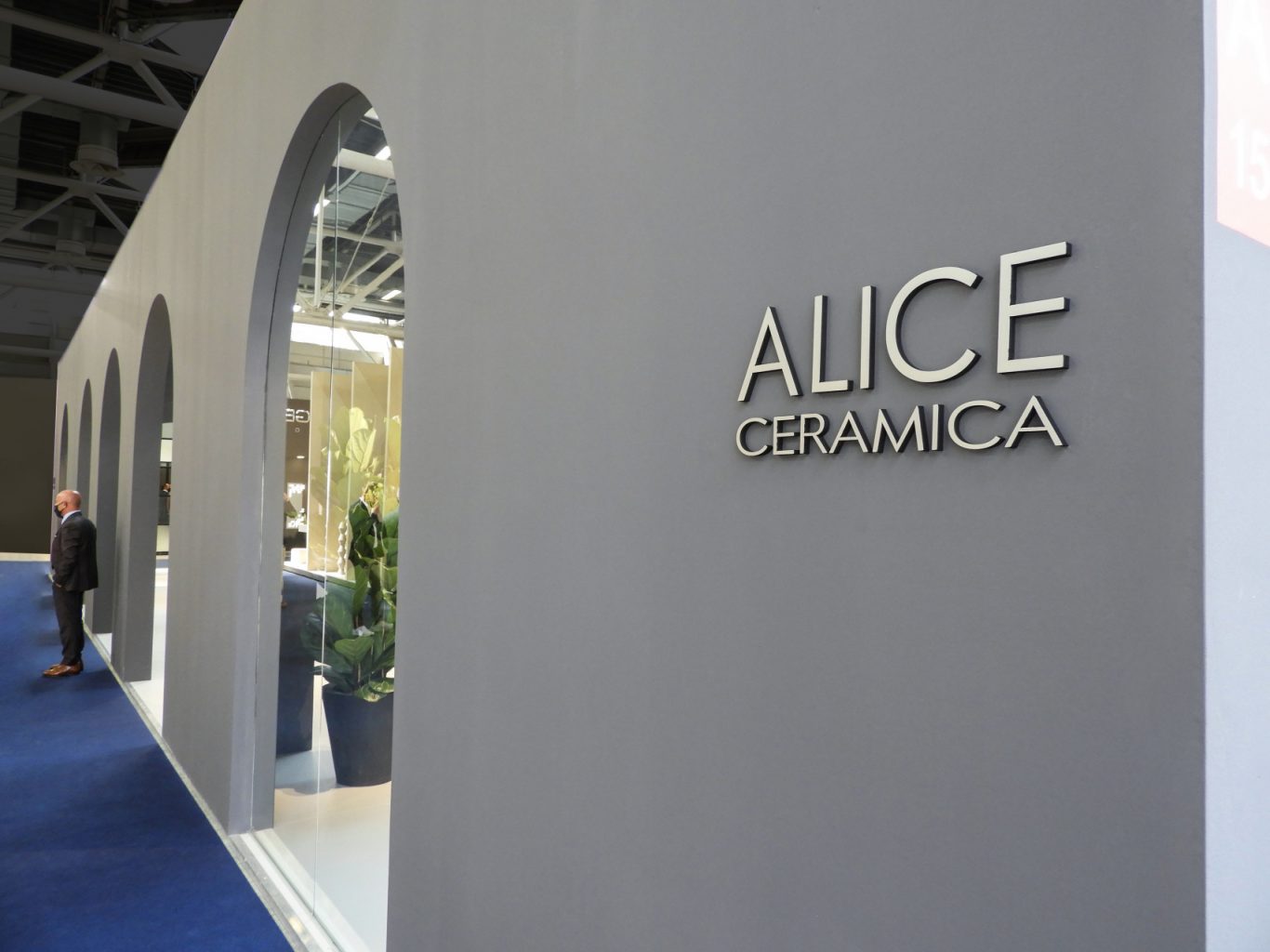
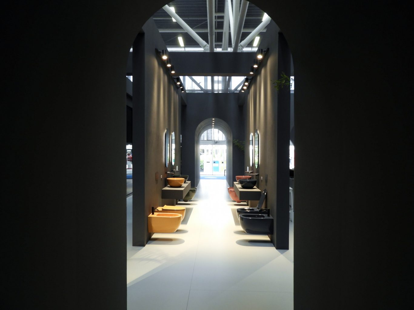
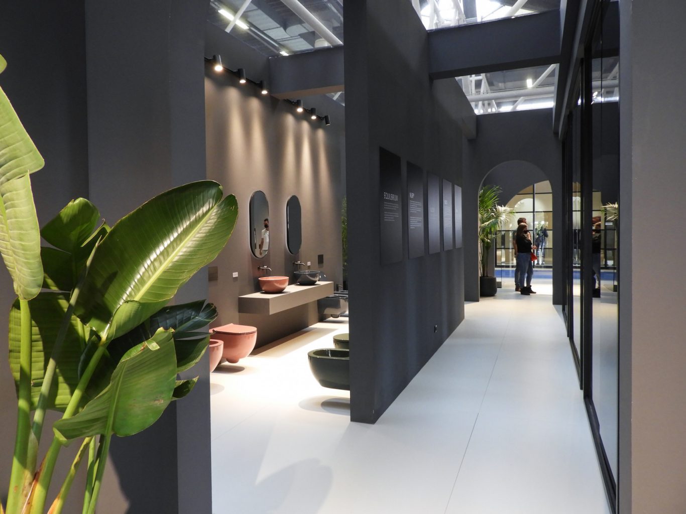
The stand of Alice Ceramica at Cersaie 2021 is a perfect example of minimalist and modern design, with a clean and geometric aesthetic that immediately catches the eye. The main structure, cubic in shape, with grey walls, conveys a sense of solidity and sobriety. The large open arcades on the sides not only offer transparency, but also invite visitors to enter the exhibition space, creating a natural and welcoming flow.
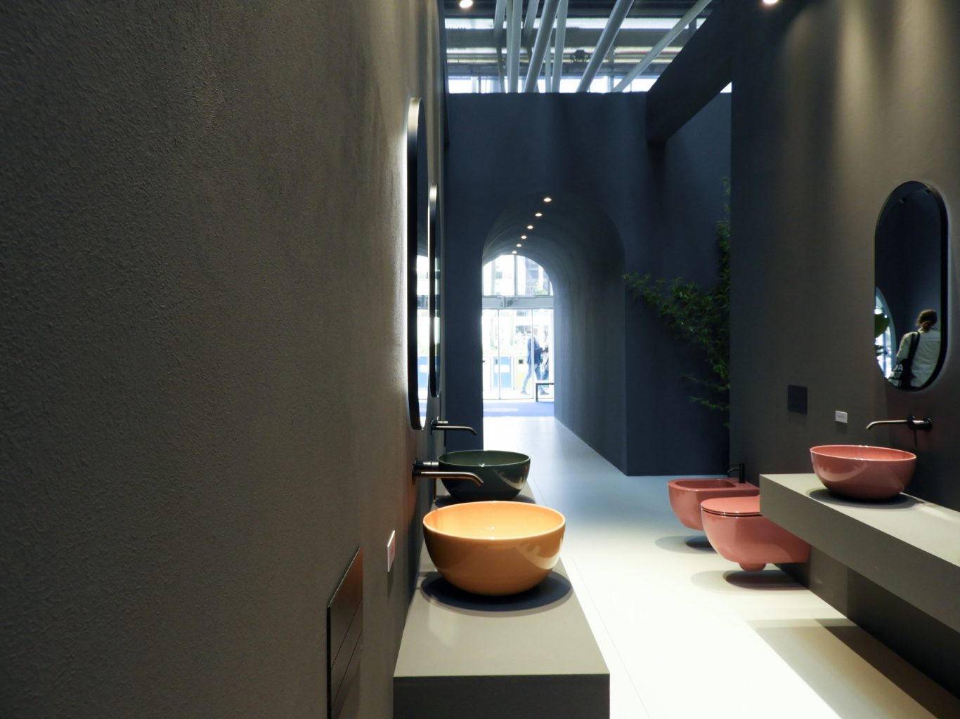
The essential colour palette contributes to creating an elegant and refined atmosphere. This colour choice not only enhances the modernity of the stand, but also makes it visually appealing and in line with contemporary design trends.
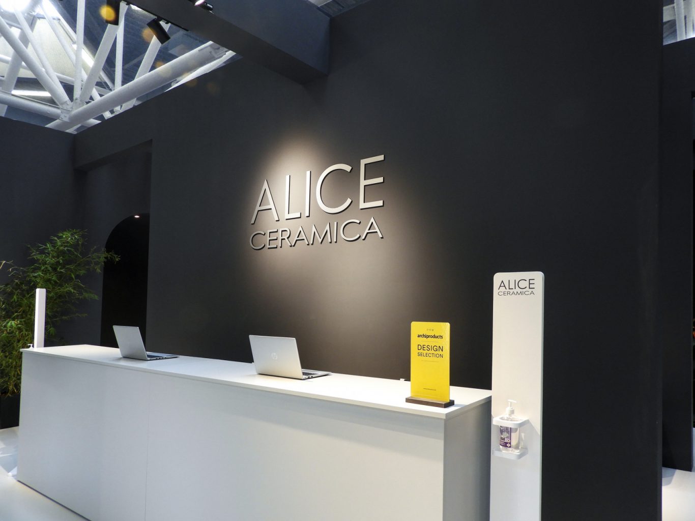
The decorative elements are carefully chosen to add a touch of freshness and naturalness to the room. The green plants, strategically placed near the openings, create a pleasant contrast with the neutral tones of the stand. The logo of Alice Ceramica, clearly and visibly positioned on the front wall, reinforces the brand identity and ensures that visitors immediately associate the stand with the company. This strategic positioning of the logo is crucial for branding and creating a lasting memory in the visitors’ minds.
Overall, the stand of Alice Ceramica at Cersaie 2021 communicates an image of modernity, essentiality and refinement. Each element of the stand is designed to reflect the brand’s identity and offer visitors a unique visual and sensory experience. This approach not only attracts the attention of visitors, but also invites them to explore and interact with the exhibition space, creating an emotional bond with the brand.
Project Info
- Client
- Alice Ceramica s.r.l.
- City
- Bologna
- Exhibitions
- Cersaie
- Year
- 2021

