Alice Ceramica
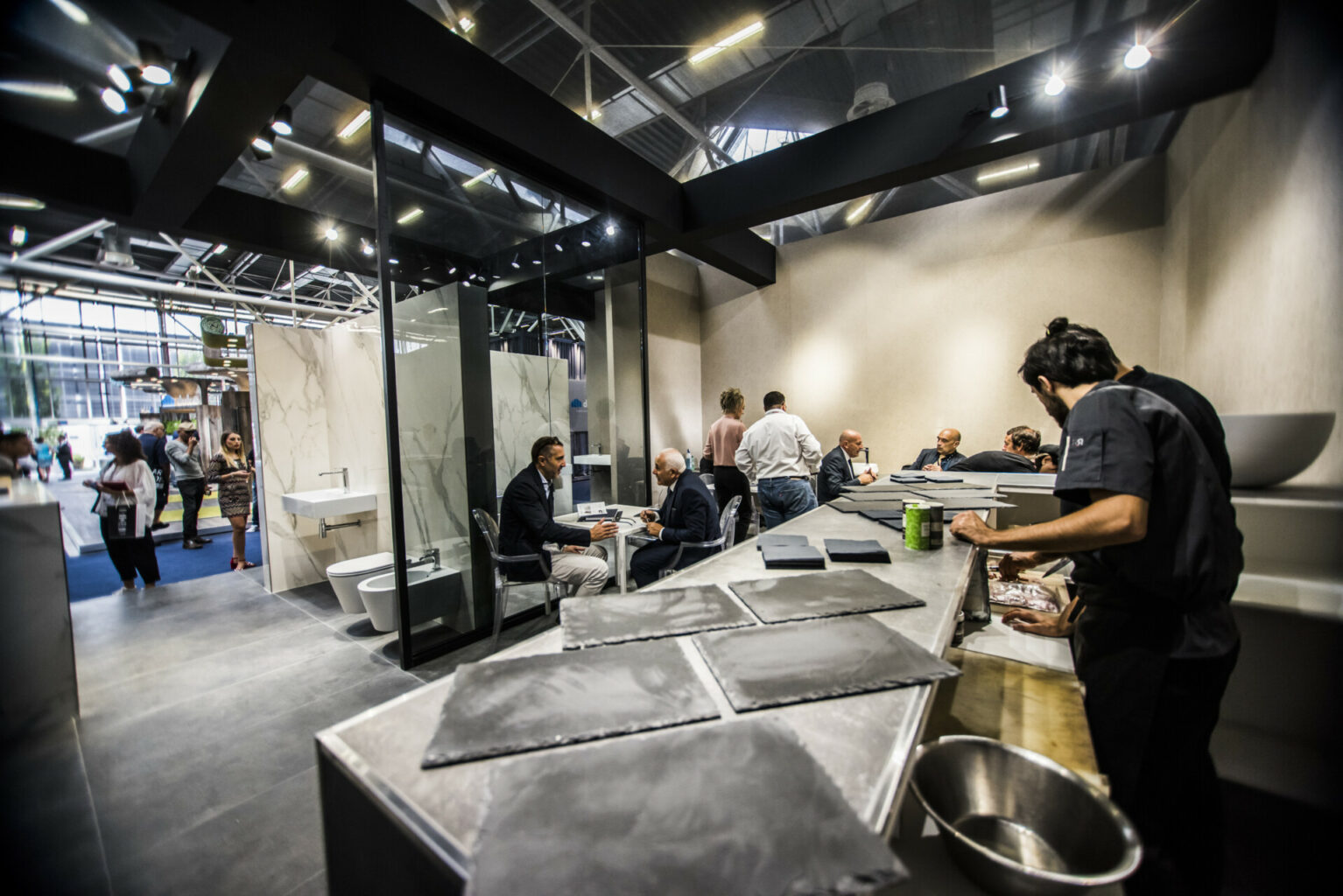
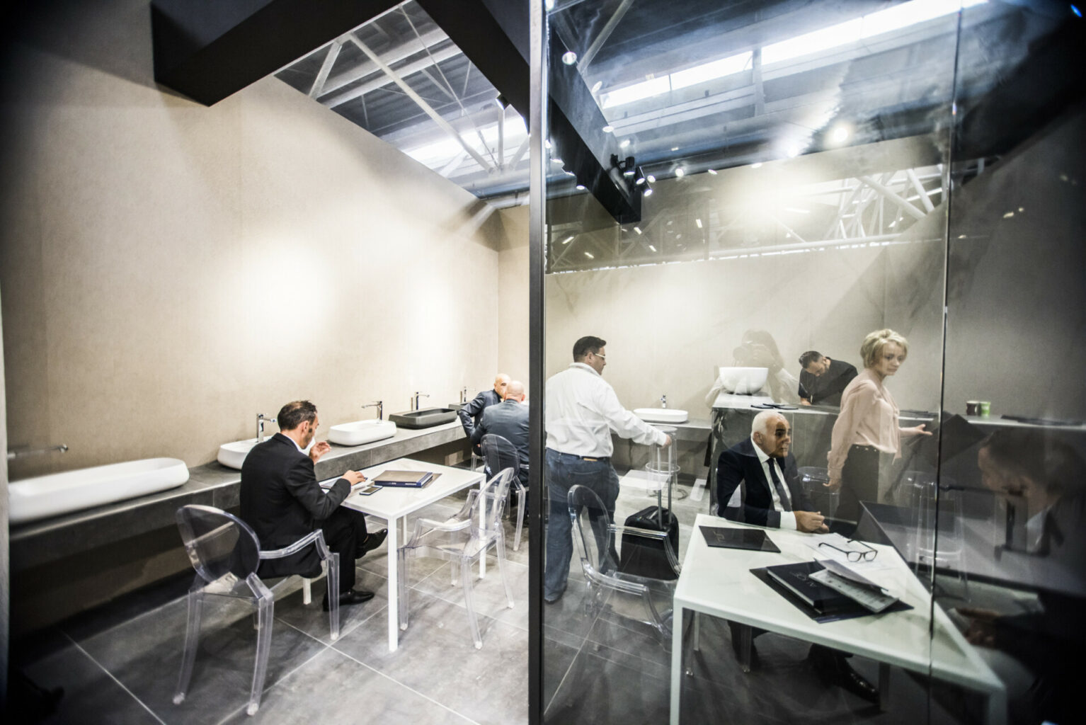
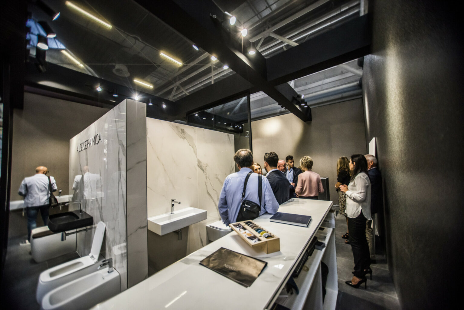
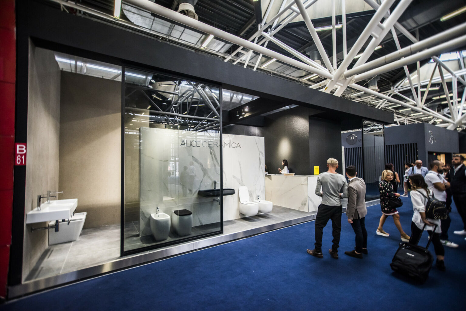
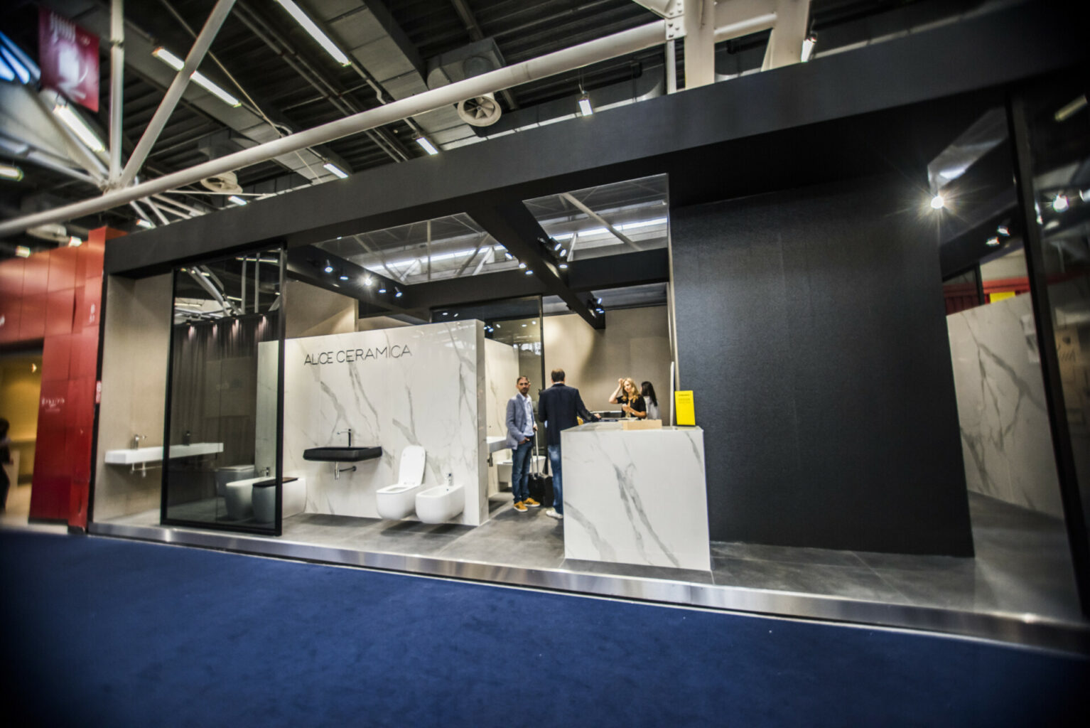
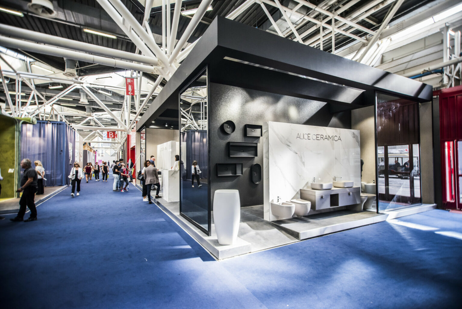
Imagine entering a space that envelops you with its elegance and modernity. The stand of Alice Ceramica is a perfect example of minimalist design, where every detail is studied to create a sophisticated and welcoming atmosphere. The open structure of the stand, with partitions that do not reach the ceiling, offers a feeling of space and freedom. This design allows visitors to view products from different angles, creating a dynamic and engaging visual experience.
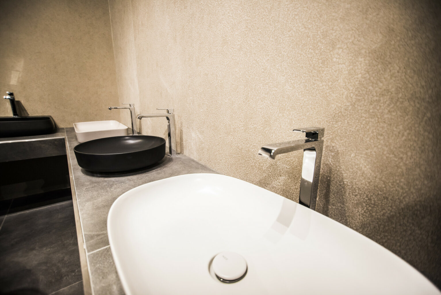
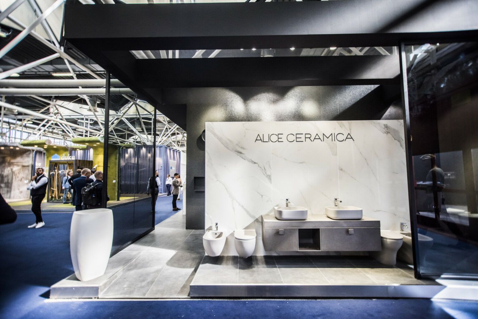
The dominant colours – white, black and grey – give the stand a timeless elegance. The bright blue floor not only adds a touch of liveliness, but also attracts visitors’ attention by guiding them through the exhibition space. The use of precious materials such as marble, stone and glass underlines Alice Ceramica’s commitment to quality and design. These materials not only enhance the aesthetics of the stand, but also communicate a sense of luxury and durability.
The lighting is carefully designed, with spotlights that highlight the products on display. This targeted lighting creates a welcoming atmosphere and invites visitors to explore every detail of the white ceramic washbasins and sanitary ware, which stand out beautifully against the dark background. The absence of unnecessary decorative elements, except for some plants or pots, keeps the focus on the products. This minimalist approach not only enhances the intrinsic beauty of products, but also reflects current trends in interior design, which privilege simplicity and functionality.
Overall, the stand of Alice Ceramica is not only an exhibition space, but a brand experience that communicates elegance, modernity and minimalism. Each element is designed to reflect the brand identity and offer visitors an unforgettable experience
Project Info
- Client
- Alice Ceramica s.r.l.
- City
- Bologna
- Exhibitions
- Cersaie
- Year
- 2018

