Baruffaldi F.lli
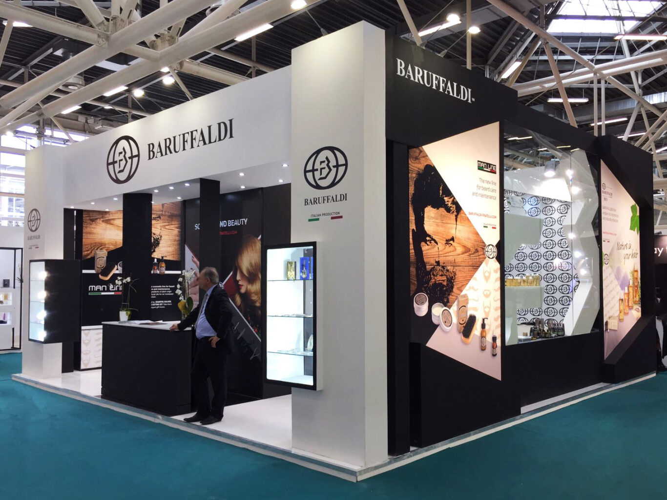
Baruffaldi’s stand at the 2018 Cosmoprof Exhibition is a perfect example of modern design, designed to highlight the company’s products in an elegant and professional way. This exhibition space is not just a showcase for products, but a visual experience that captures the eye and invites visitors to explore.
The overall design of the stand is characterised by a predominant use of black and white, with clean lines and minimalist decorative elements. The angular structure maximises the exhibition space and creates a welcoming area for visitors. The open design invites visitors to come in and interact with products and staff, making the experience more engaging.
The Baruffaldi logo is prominent in several areas of the stand, ensuring brand recognition. The graphics are bold and eye-catching, with high quality images and clear, concise text. The displays are well-lit and organized, showcasing products effectively. Note a column display with illuminated glass shelves, ideal for small products. A screen is strategically placed to show presentations and promotional videos, attracting the attention of passers-by.
An area dedicated to counselling, with high stools and a counter where visitors can interact with staff. The lighting is well designed to highlight products and create an inviting atmosphere. The materials used look high quality, with elegant and durable finishes. The green floor of the stand contrasts with black and white, helping to delimit the exhibition area.
Overall, the stand of Baruffaldi at Cosmoprof 2018 conveys an image of professionalism, quality and modernity. The effective use of graphics, lighting and space creates an engaging experience for visitors, reflecting the excellence and innovation of the Baruffaldi brand.
Project Info
- City
- Bologna
- Exhibitions
- Cosmoprof
- Year
- 2018

