Officine Gullo
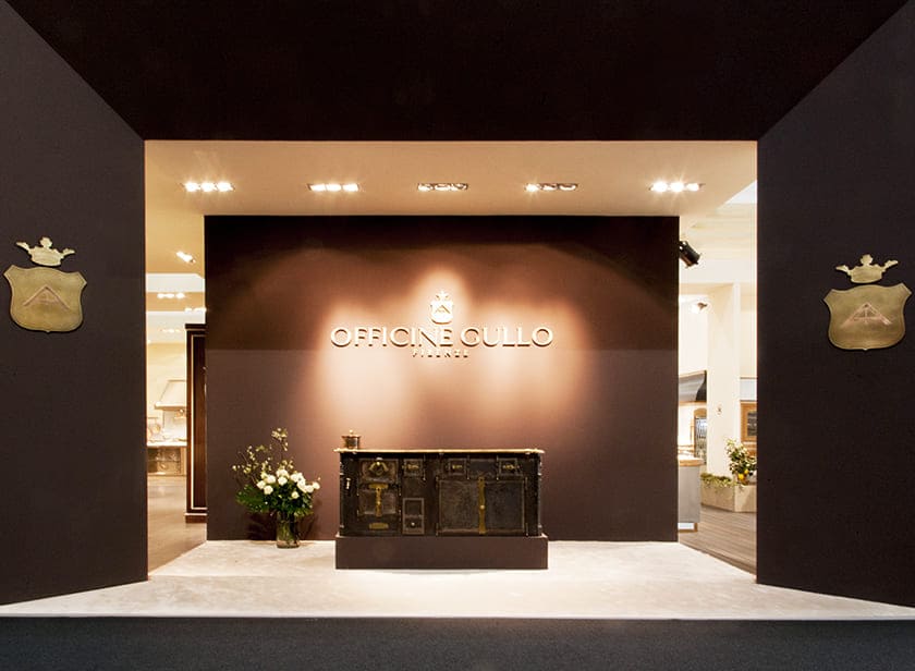
The stand of Officine Gullo, created by us for the Salone del Mobile 2018, was designed to evoke a sense of luxury and sophistication, just like the kitchens that the company produces. This exhibition space was designed to attract visitors and communicate the brand’s values.
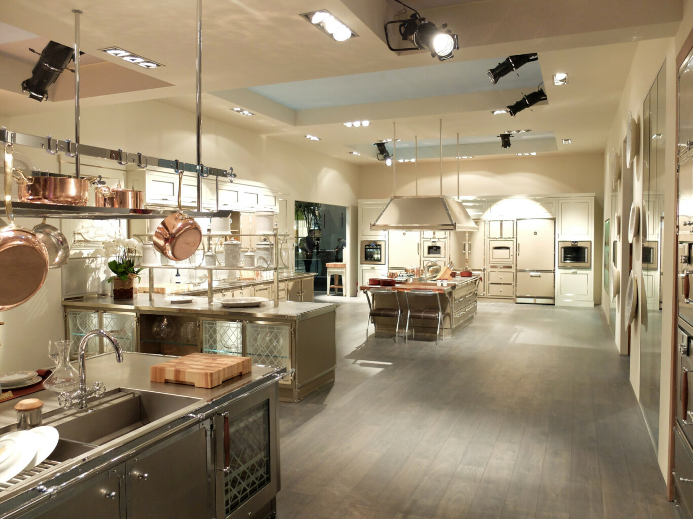
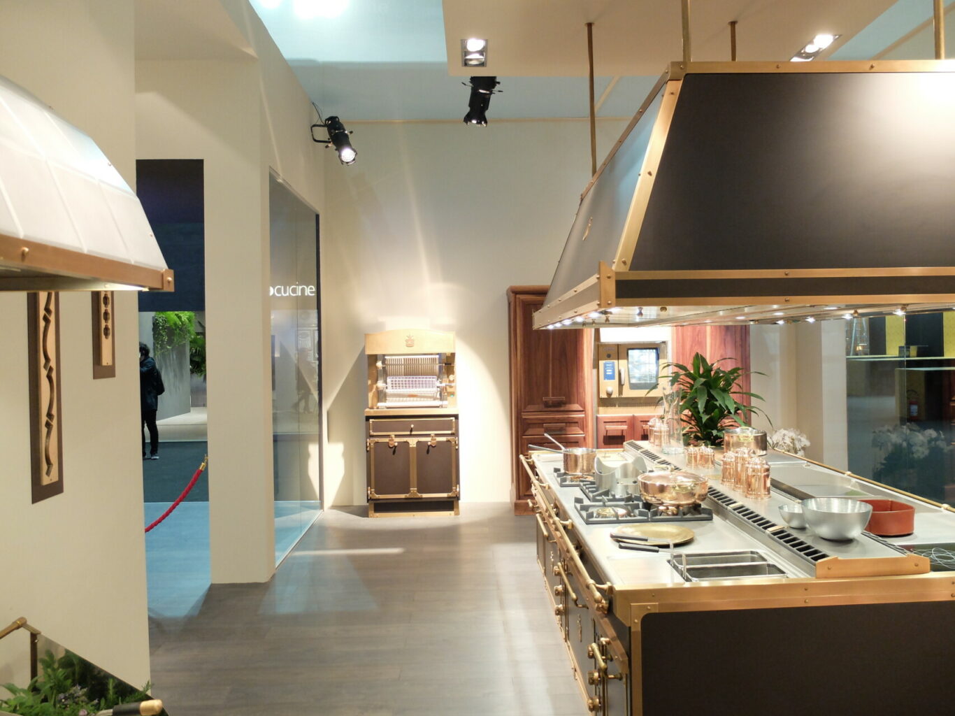
The stand has a modern angular shape, with dark exterior walls that create a contrast with the bright interior. The Officine Gullo logo is clearly visible on both sides of the corner, ensuring a strong brand presence. A large glass display offers a clear view of the interior, where products are displayed. The interior lighting is designed to highlight the details and materials of the kitchens, attracting the attention of visitors.
The interior of the stand recreates an elegant home environment, with green plants that add a touch of freshness and naturalness. You can see elements of a kitchen, such as an island or a cooking block, and probably other details like appliances and accessories. The materials used for the stand are of high quality, such as wood, metal and glass, to reflect the craftsmanship and attention to detail typical of the Officine Gullo brand.
Overall, the stand of Officine Gullo at Salone del Mobile 2018 was designed to be attractive and functional, with a particular focus on product presentation and corporate branding. The use of high quality materials and elegant design makes the space dynamic and interesting for visitors, effectively communicating the brand’s values: luxury, craftsmanship, Italian design and attention to detail.
Project Info
- Client
- Officine Gullo s.r.l.
- City
- Milano
- Exhibitions
- Salone Del Mobile
- Year
- 2018


