SAF
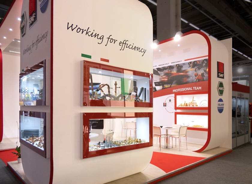
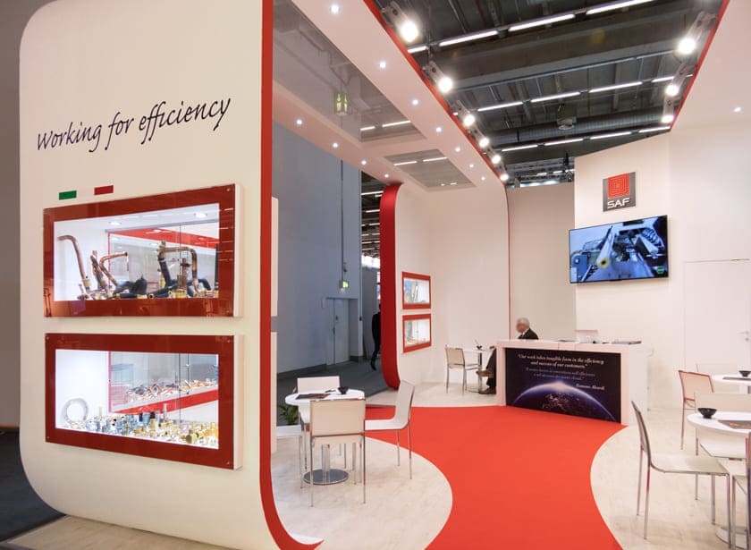
Imagine walking through the stands of the prestigious ISH Frankfurt Trade Fair in 2019, and being suddenly attracted by a space that exudes modernity and functionality: the SAF stand. This space has been carefully designed to effectively communicate the company’s identity and values, and every detail is thought to capture the attention of visitors.
Key Elements of the SAF Stand
Design: The curved lines and contrasting colours (white, red and grey) create a dynamic and attractive aesthetic. The use of glossy materials and targeted lighting contribute to a sense of professionalism and modernity, making the stand a real visual reference point.
Products Exhibition: The illuminated cabinets with red frames highlight SAF products, making them protagonists of the stand. The arrangement of products at different heights guides the visitor’s gaze, creating an interesting and engaging visual path.
Meeting Area: The presence of tables and chairs create a cozy space for meetings and consultations with potential customers. This corner is designed to facilitate dialogue and the building of solid professional relationships.
Visual Communication: The “Working for efficiency” claim and SAF logo are clearly visible, reinforcing the brand identity. The presence of the Italian flag suggests a strong link with the territory and the national production tradition, evoking a sense of pride and reliability.
Overall, the SAF stand is a perfect example of how well designed design can not only attract visitors’ attention but also communicate a company’s values and identity clearly and effectively. This space is not just an exhibition venue, but a real marketing tool reflecting the innovation and quality of SAF products.
Project Info
- Client
- Saf s.r.l.
- City
- Francoforte
- Exhibitions
- ISH
- Year
- 2019


