Tipografia Former
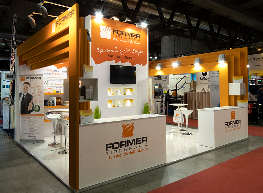
The Former stand at Viscom 2018 stands out for its modern and eye-catching design, with a clear focus on the brand.
Bright orange and white dominate the stand, creating a strong and visible contrast. The red carpet further highlights the stand, attracting visitors’ attention.
The stand is open and inviting, with no front-of-door barriers to prevent access or view. A raised area for presentations and demonstrations is equipped with a large screen.
The “FORMER TIPOGRAFIA” logo is clearly visible in different positions and sizes, accompanied by the slogan “your printing world”. The message “The point on quality. Always.” underlines the company’s commitment to quality.
Elements
White high tables with stools: They offer an informal area for discussions with visitors.
Well-designed lighting: Spotlights highlight key areas of the stand.
Exhibitors for products or printed materials, help to present the company’s offer.
Overall, the stand conveys an image of professionalism, modernity and accessibility in line with Former’s aim to be a reliable partner in the world of printing.
Project Info
- City
- Milano
- Exhibitions
- Viscom
- Year
- 2018

